The Brands of ID&E Group
Release:
Update:
NEW
We established Integrated Design & Engineering Holdings Co., Ltd. (hereinafter referred to as ID&E) on July 3, 2023, and started a new chapter as the ID&E Group. Furthermore, Nippon Koei Co., Ltd. has been split into four companies: three segments identified as core businesses—Consulting, Urban & Spatial Development, and Energy—and a company for group management.
Prior to the establishment of ID&E, Nippon Koei Urban Space Co., Ltd. was established in July 2022, Nippon Koei Business Partners Co., Ltd. began operations in July 2023, and Nippon Koei Energy Solutions Co., Ltd. began operations in October 2023.
We would like to introduce the meaning behind our company name and logos.
Origin of the Company Name
The company name is "Integrated Design & Engineering Holdings Co., Ltd."
The "design" and "engineering" elements capture our company’s business as a comprehensive engineering consultant which includes our traditional portfolio of civil engineering and construction, that we have pursued as of our previous long-term management strategy, with the addition of the energy business. The "integrated" aspect manifests our intention to integrate our various business domains to provide one-stop services in the future.
The brand-new name carries the wish to bring in multiple new partners along with values not previously existent in the Group, stimulating new value creation and expanding the Group even further.
■Logotype

- *The Japanese company name 'ID&E' is derived from the initials of its English name.
Open Innovation Through Integration of Civil Engineering, Architecture and more
■Symbol Mark
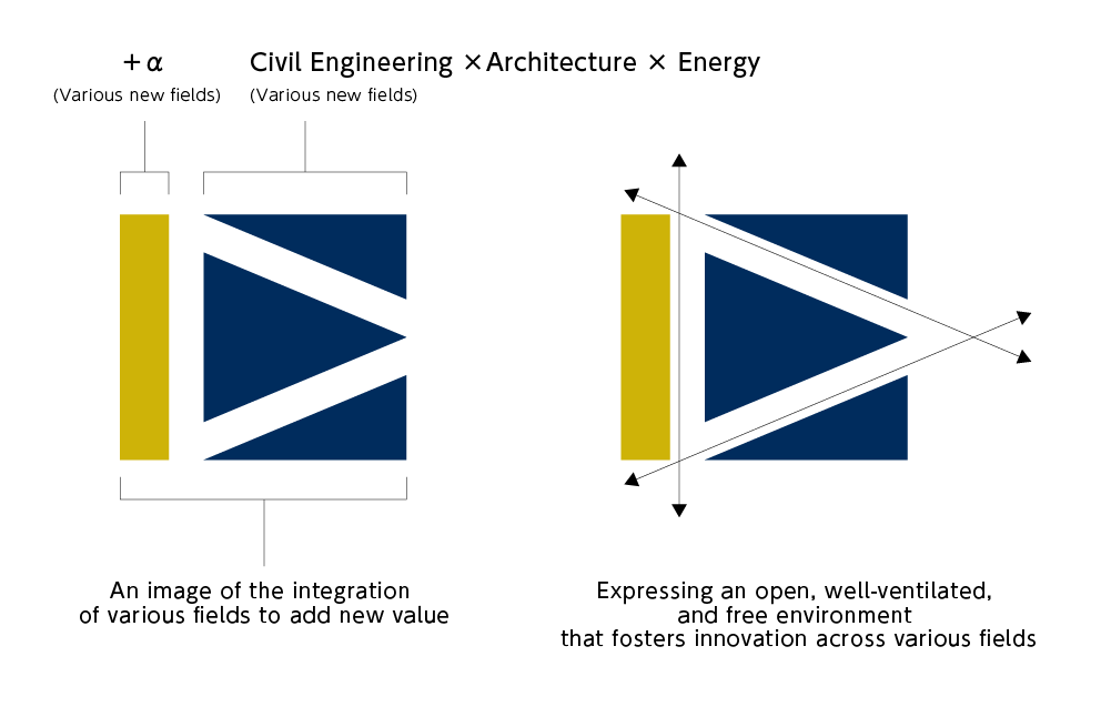
The "Symbol Mark" design embodies following origins. For the colors, we have used two colors, ultramarine blue and gold. A play on the meaning of the Japanese characters for "ultramarine," which is "group blue," our ultramarine imbues the traditional NKG blue with the sense of our various companies coming together to form a group. The gold evokes a sense of new value and new possibilities.
The ultramarine portion depicts the "D" and the "E" which represent the Group to date, while the gold "I" is an implication of the integration of various fields to add new value.
The white portion of the logo symbolizes the free and open environment that will drive in novation among the various fields.
The "Symbol Logo" of NK Group inherits the brand of Nippon Koei and expresses autonomy with sub-elements.

The logos of the four companies spun off from Nippon Koei (Nippon Koei, Nippon Koei Urban Space, Nippon Koei Energy Solutions, and Nippon Koei Business Partners) use the symbol logo that the Nippon Koei Group has been using so far, maintaining brand consistency and inheriting the brand. The Nippon Koei Group symbol logo was established in March 2007, on the occasion of the 60th anniversary of Nippon Koei's founding, with the aim of further developing the group and fostering a sense of unity.
■Sub-element
The logos of Nippon Koei, Nippon Koei Urban Space, Nippon Koei Energy Solutions, and Nippon Koei Business Partners are designed with the company names in the corporate color blue (NK Blue) and feature sub-elements in each company's theme color.
These sub-elements are based on the motif of a bridge that connects people and their lives, as a form of consulting and engineering to make the world a better place to live. The dynamic, perspective-filled shape connects the present with the future and expresses a positive attitude of moving forward with momentum.
■Theme colors and concept of each company
この表は横スクロールできます
| logo |  |
 |
 |
 |
|---|---|---|---|---|
| Company name | Nippon Koei | Nippon Koei Urban Space | Nippon Koei Energy Solutions | Nippon Koei Business Partners |
| Theme colors | Blue (NK Blue): Represents the pursuit of technology and integrity. | Red: Symbolizes urban activity, liveliness of life, and technical enthusiasm. | Green: Signifies the circulation of energy and harmony with the environment and nature. | Yellow: Represents connections, collaboration, and the vitality of human resources. |
| Concept | Covering essential infrastructure projects with advanced expertise, building nations, societies, and supporting global safety and security. | Creating vibrant and active urban environments by transcending the boundaries of civil engineering and architecture, focusing on city planning for each resident. | Promoting carbon neutrality and the use of renewable energy, walking in harmony with the environment, and supporting future lifestyles. | Acting as a portal to connect the Nippon Koei brand internally and externally, exploring new applications of technology and new challenges. |
Company Emble
The company emblem, which has been used since the founding of Nippon Koei (Figure 1), is a design conceived by the executives at that time, combining the characters “日” at the top and “工” at the bottom within a circular shape. In April 1955, to mark the company's full-scale overseas expansion, under the initiative of Nippon Koei's founder, President Yutaka Kubota, the emblem was revised to include the letters "N" and "K" in the center of the original design (Figure 2).
This emblem is still used today by Nippon Koei, Nippon Koei Energy Solutions, and Nippon Koei Business Partners.